Are your Facebook ads targeted well?
Images and photos are a powerful way of communicating on Facebook. That’s what catches people’s eye in the first place. Research at 3M Corporation concluded that we process visuals 60,000 times faster than text.
Below are Facebook’s three ad image best practices. See what you think:
- Choose an image that is directly relevant to your product or service
- Use an image that is bright and eye-catching, even when viewed at a small size
- Avoid images that have many small details or text and opt for something simple instead
General guidelines
To keep adverts high quality and engaging, guidelines have been set for the amount of text you can include in an image.
Excessive text in ad images may result in your ad reaching fewer people or not running at all. Try to use little or no image text when possible. The guideline is called Facebook text overlay policy. It’s a condition stating that any picture used for marketing must have no more than 20% text in it. There’s a tool that can help you determine how much text is in your ad image.
Review period
When you place your advert order, it goes through a review process to make sure that it’s OK with Facebook policies. Advert reviews may take up to 24 hours but are faster in a lot of cases. When it’s ready to go, you’ll get a notification that your advert has been approved.
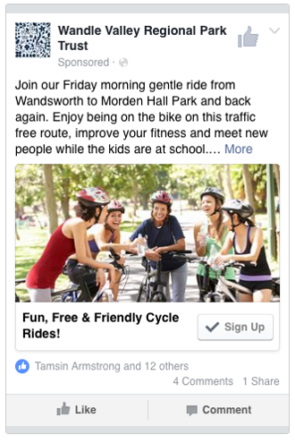
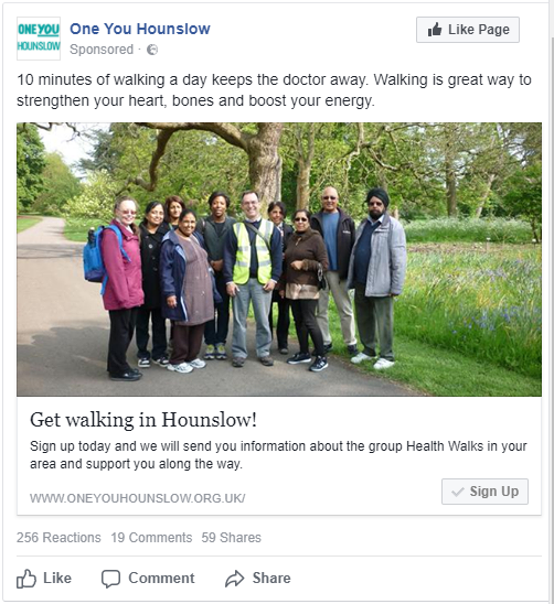
Here are a few pictures that work


What images should you use in your promotion?
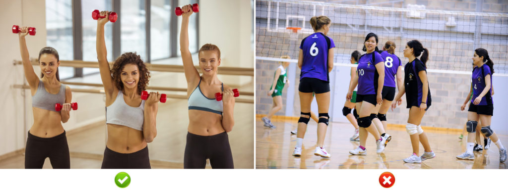
We have done a lot of testing. We found that the most effective images should generally be showing someone similar to the people you’re trying to attract, smiling and looking like they’re having a good time.
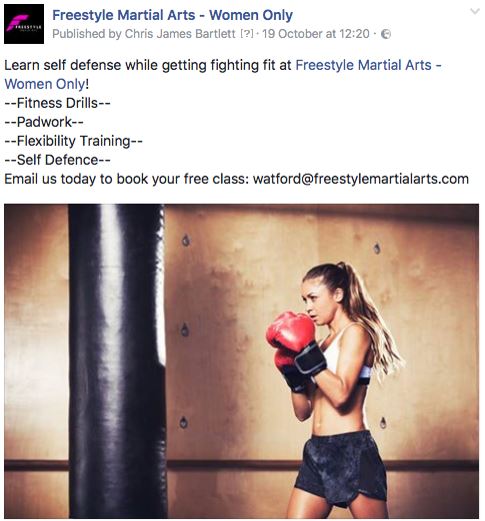
Inactive people don’t want to see sweaty, red-faced people doing the activity, so don’t show anyone who’s really intense.
You can find free photos to use in your promotion at www.promotingactivity.com.
Here you can see 3 images in their respective Facebook ads


